Elevating UX: Graphics in Brand Building
Unifying Three Brands Through Visual Systems
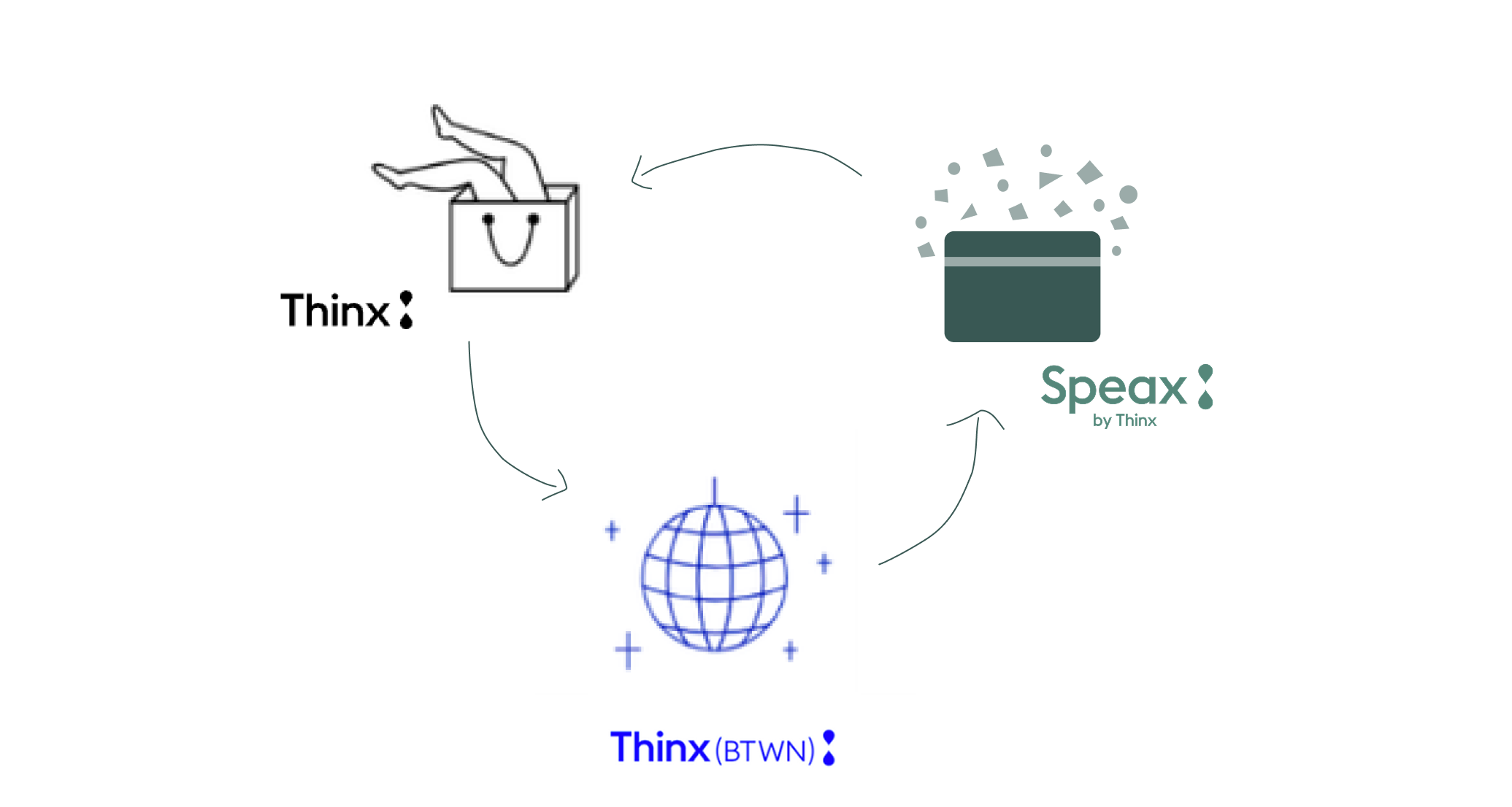
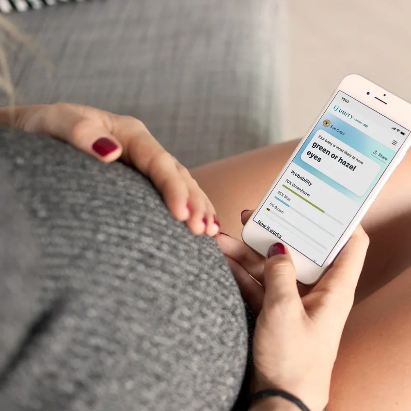
The Speax redesign was part of a tri-brand unification across Thinx Inc. and GiveRise. Our goal as a team was to create a user-centered navigation system that connected three brands while improving clarity and conversion. Delivered a high-performing MVP in 6 months and contributed to more than $1M in revenue.

Results
Cross-Brand Synergy
- Speax → Thinx: 11.99 percent
- Speax → BTWN: 3.47 percent
- BTWN → Thinx: 25.37 percent
- BTWN → Speax: 7.94 percent
- Thinx → Speax: 3.45 percent
- Thinx → BTWN: 3.80 percent
Conversion
- Speax campaign: 4.32 percent conversion
- 105.7 percent increase from previous benchmarks
Revenue Growth (within two months)
- Speax: +15.9 percent
- Thinx: +14.7 percent
- BTWN: +27.1 percent
- Total revenue lift: $1,024,950.00
Overview
In this project, I aimed to measure how illustration can enhance brand clarity and user comprehension throughout the product experience. As the art and UI designer, I conducted a visual audit that revealed inconsistent iconography, unclear hierarchy, and a 30-40% percent drop in engagement on key informational screens. I developed an illustration system that unified style, reduced cognitive load, and increased scanability during user testing. This case study outlines my approach to creating a consistent, research-informed visual language that strengthened the brand and improved overall usability.
Problem
Inconsistent experience across three brands:
- Thinx, Speax, and GiveRise each had their own design systems
- Users struggled to understand product differences
- Checkout and navigation felt fragmented
- Low clarity on which product fit their needs
Result: Confusion, friction, and lost conversions.
Outcome
Inconsistent experience across three brands:
- Thinx, Speax, and GiveRise each had their own design systems
- Users struggled to understand product differences
- Checkout and navigation felt fragmented
- Low clarity on which product fit their needs
Result: Confusion, friction, and lost conversions.
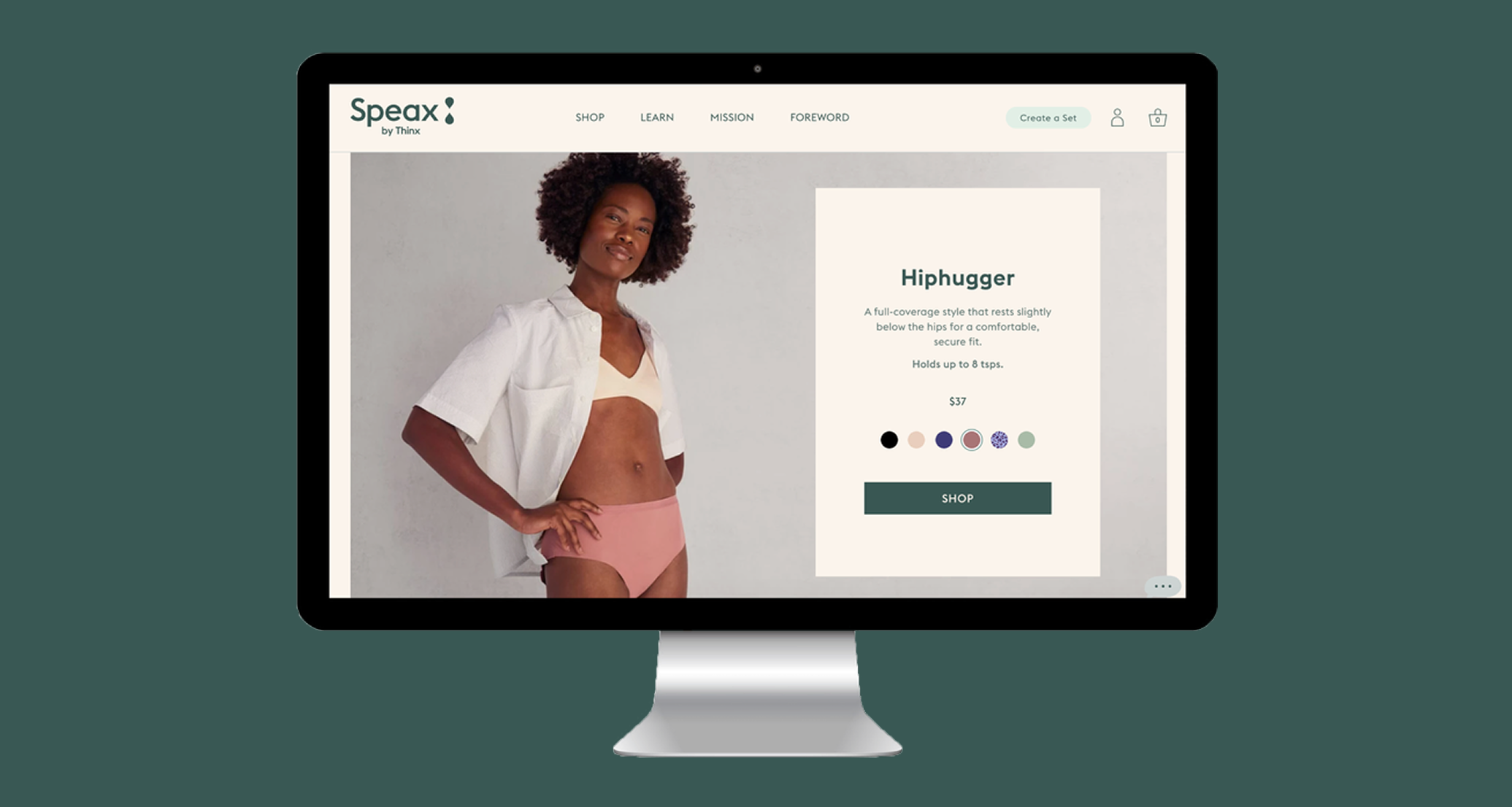
My Contribution
- UI design for Speax ecosystem
- Original icon and illustration system
- Collaboration with UX, Creative, Dev, Marketing, and CX
- Visual systems for sensitive, empathy-driven topics
Team: Brendan Hastings, Meng Shui, Michelle Flacks, Genna Schwartz, Elise Mortensen, Andrew Puig, Lawrence Stiersc
The Solution
Create a unified tri-brand experience:
- Cohesive navigation connecting all three product lines
- Clear visual hierarchy between brands
- A distinct illustration and icon system for Speax
- Improved clarity for sensitive topics like pelvic health and absorbency levels
Design Process
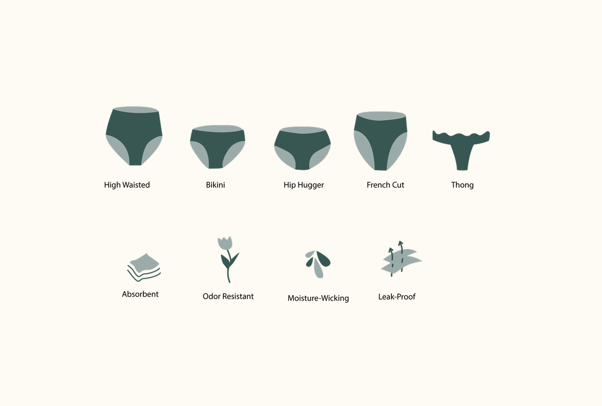
1. Explore Symbolic Icons
- Communicate product features visually
- Reduce cognitive load
- Support cross-brand consistency
(icons in development placeholder)
2. Establish Accent Colors
- Tie Speax’s palette back to primary Thinx colors
- Build harmony across brands
(color exploration placeholder)
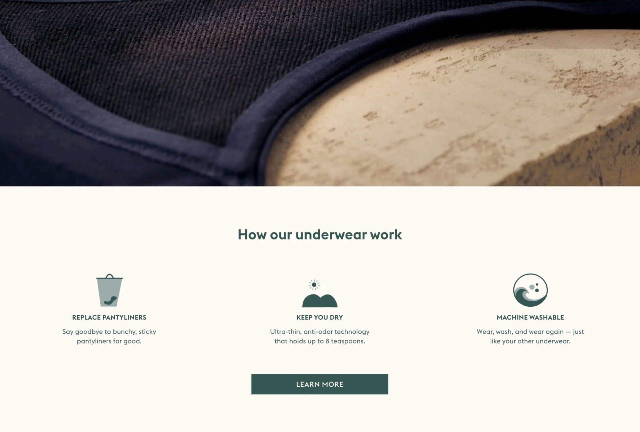
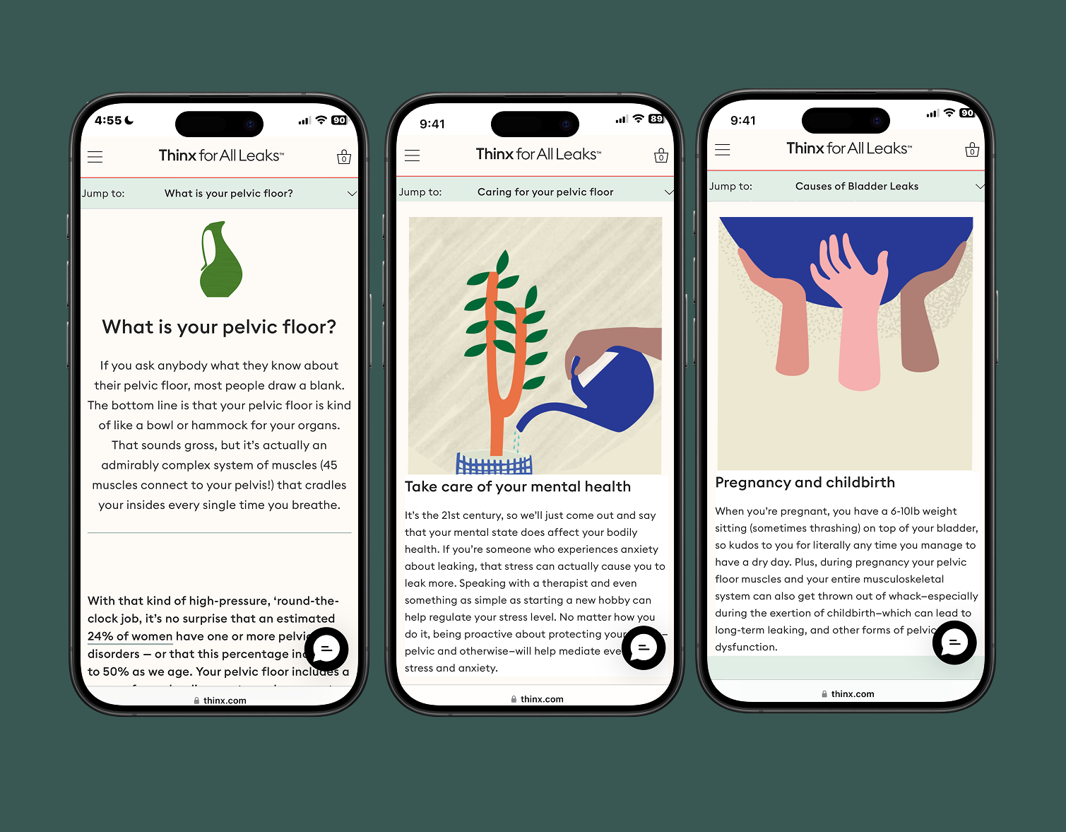
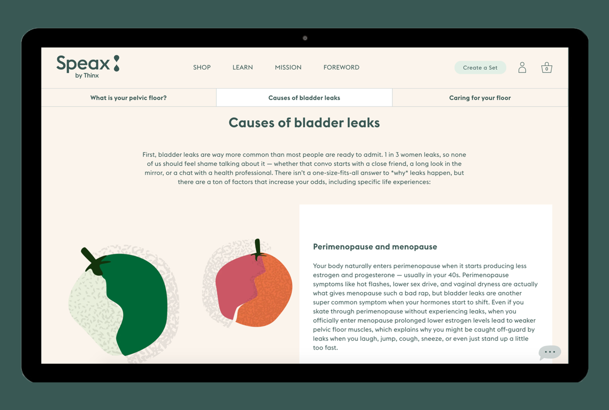
3. Build Illustrations
- Soft, empathetic drawings for a sensitive audience
- Support education and storytelling
(illustration system placeholder)
Design Goals
- Improve user journey across all three sites
- Strengthen brand identity with consistent visuals
- Increase efficiency through simplified information delivery
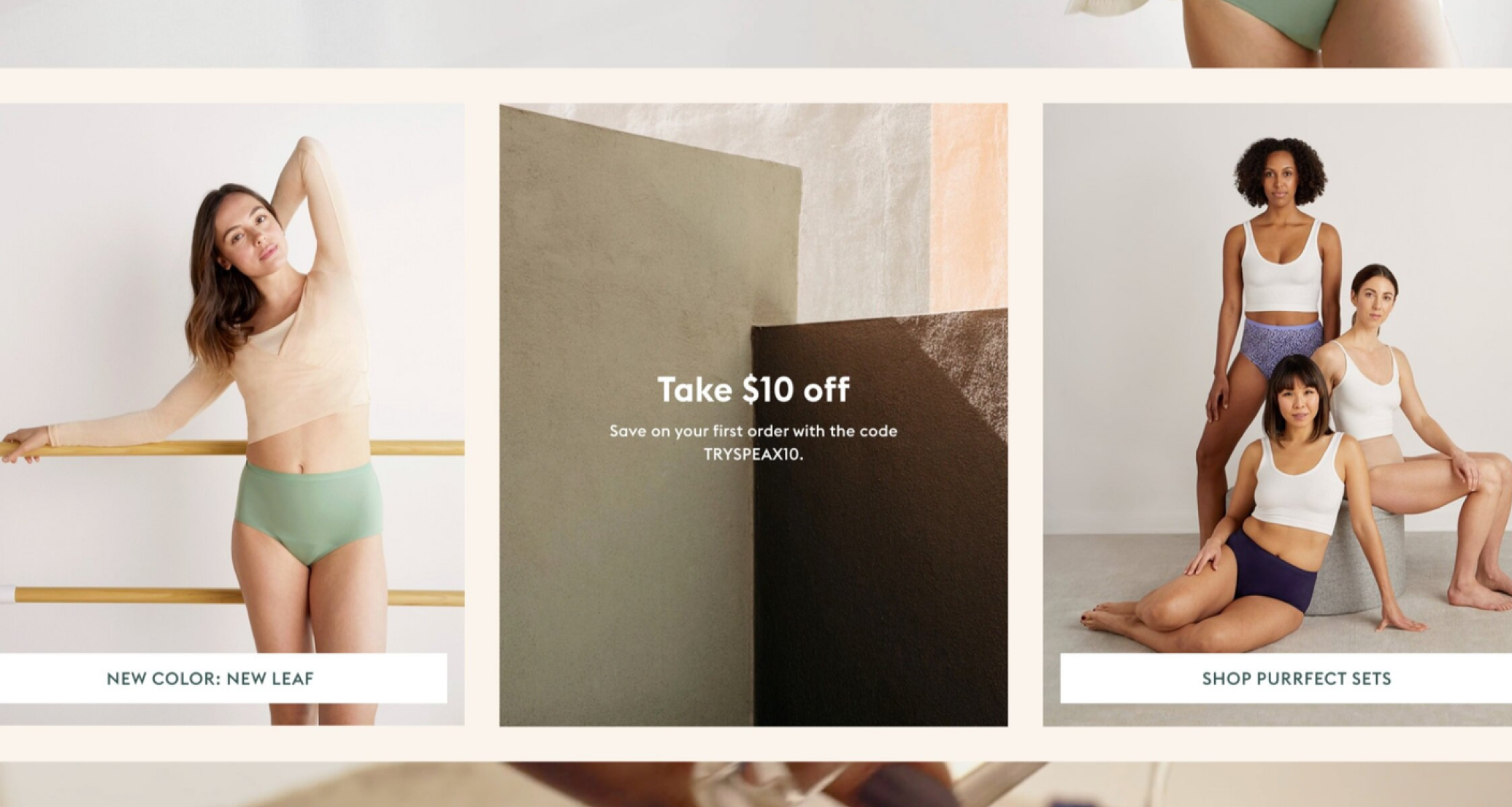
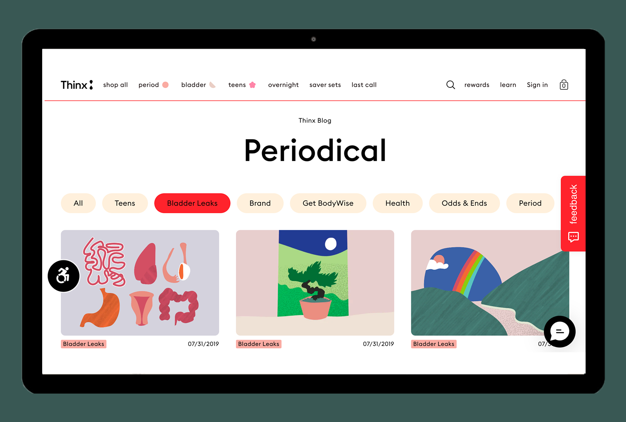
Gallery
Conclusion
This project showed me how empathetic, symbol-driven design can unify a multi-brand ecosystem while directly supporting revenue goals. By creating a single, coherent system, we improved clarity, reduced user friction, and built stronger trust across all three brands.
FAQ
A few things people usually ask me.
What kinds of design services do you offer?
I provide end-to-end product design services, including research, wireframes, UI/UX, prototypes, branding, and visual design. Each project is tailored to meet the client’s needs.
How do you work with clients and teams?
I collaborate closely with stakeholders such as brand designers, UX leads, and developers. I follow an agile, iterative process to integrate feedback, refine designs, and ensure smooth handoffs to development.
What is your typical project process and timeline?
Projects start with discovery and user research, then move through wireframing, interactive prototyping, design implementation, and developer handoff. Timelines vary by project scope, but I aim for clarity and efficiency at each stage.
What can I expect after the project is delivered? Do I keep the design files or get support?
After completion, I hand over all design assets, including mockups, source files, and style guides. I can also provide post-launch support or guidance for future iterations and maintenance.
.svg)