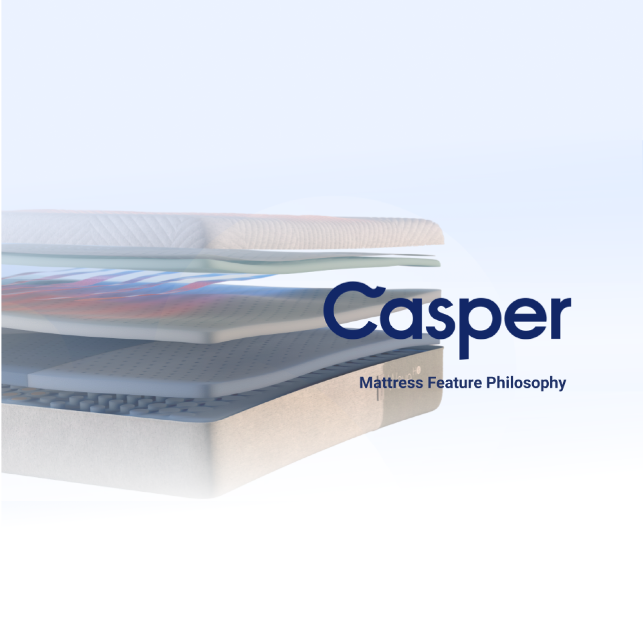
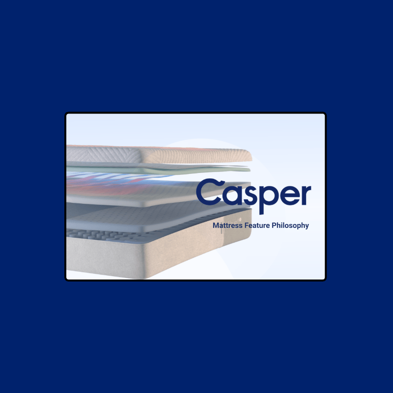
Strengthening Casper’s L&D Through Visual Systems
Translating Brand Campaigns Into Scalable Learning Systems
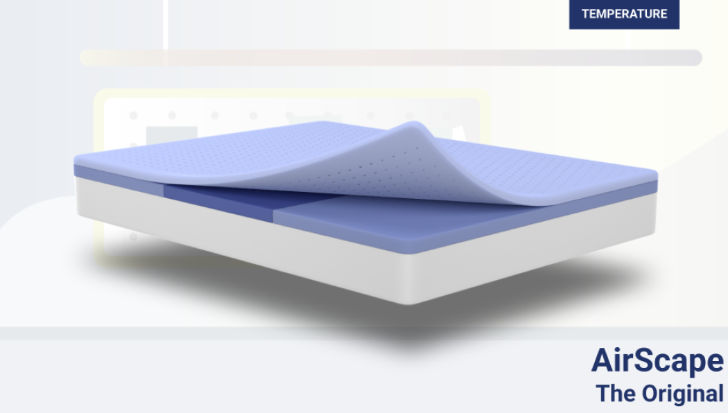
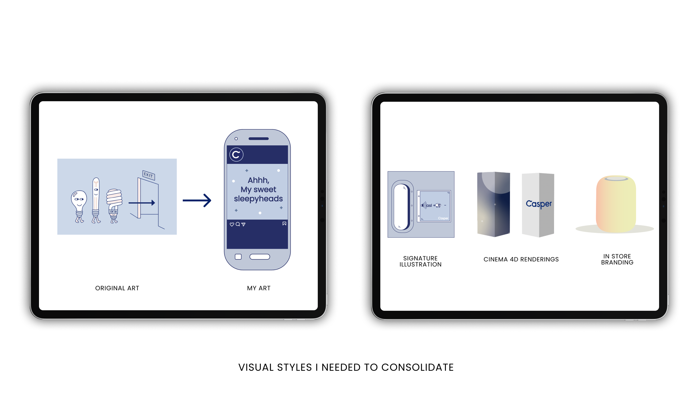
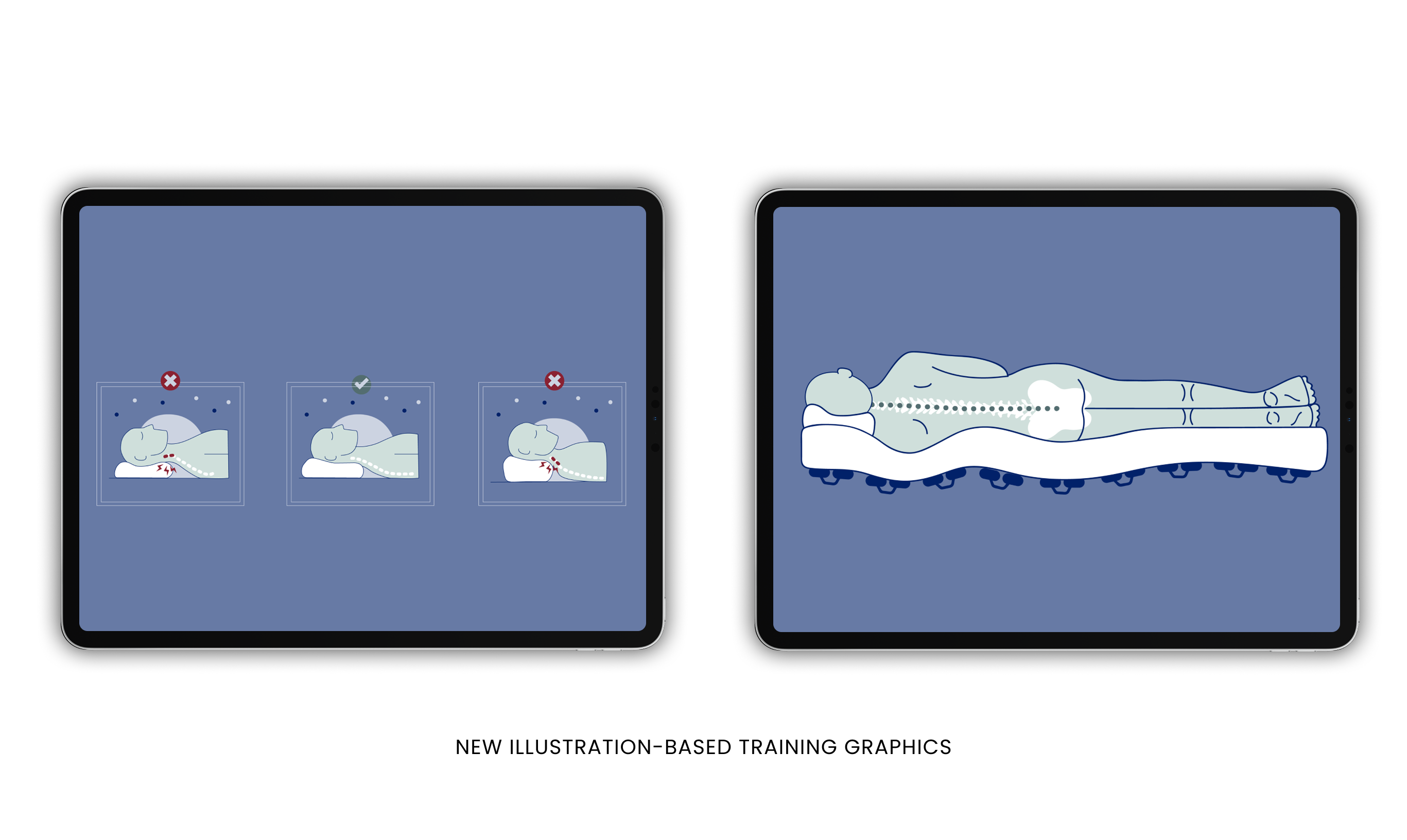
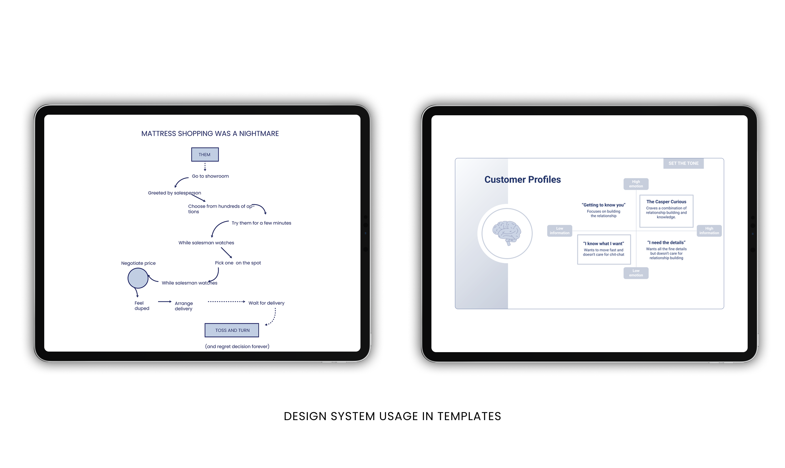
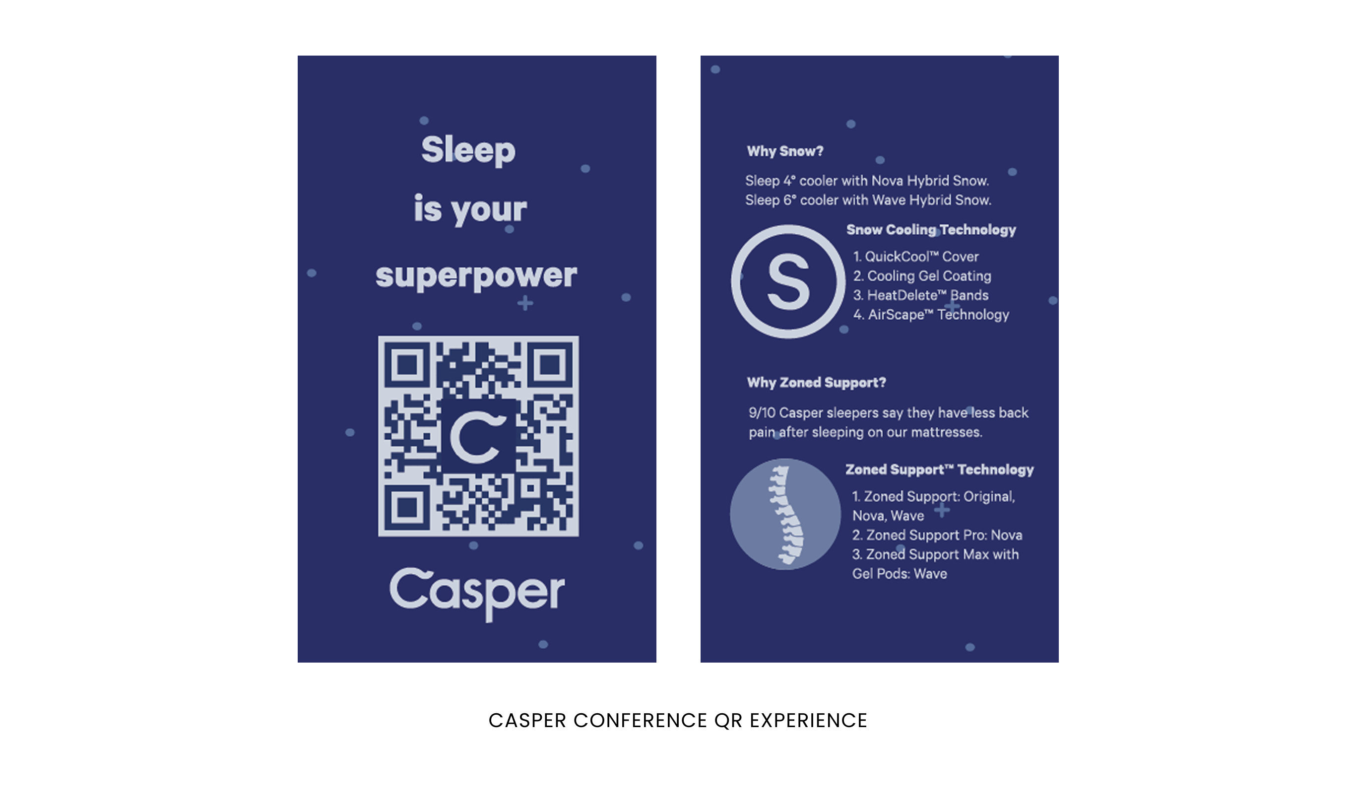
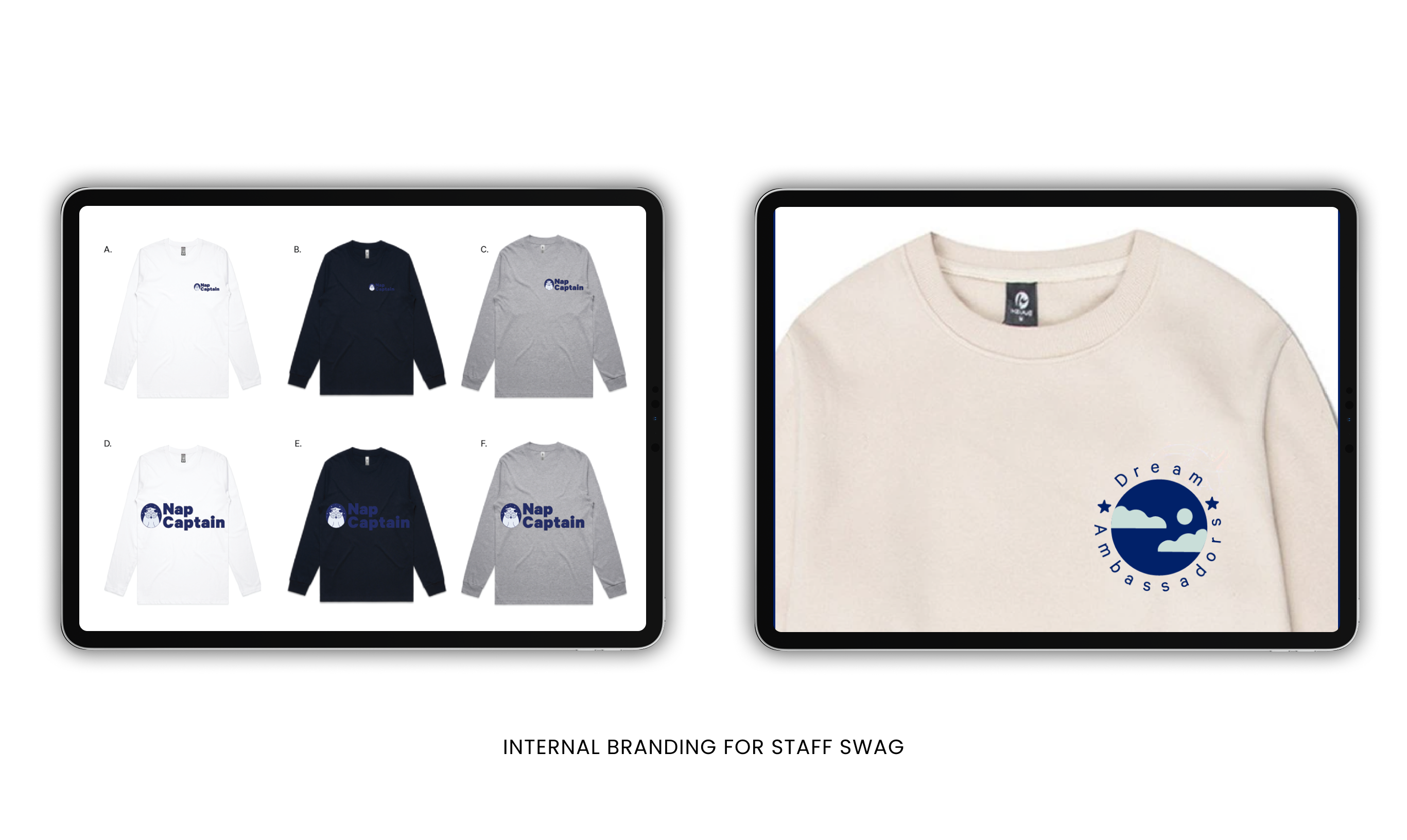
Designed a cohesive internal visual system for Casper’s training materials, expanding on the original Red Antler campaign. Streamlined and elevated the visual library to give sales teams a clear, confident way to explain mattress technology.
Results
Workflow Optimization
- Faster creation of new slides and training materials
- Improved consistency across onboarding and internal documents
- Reduced back-and-forth revisions with a unified visual system
Operational Efficiency
- HR teams produced recurring materials faster
- Reduced time spent formatting decks and documents
- Visual templates increased consistency across departments
Internal Alignment
- Stronger internal brand cohesion
- Policies and programs communicated with more confidence
- Clearer visuals supported smoother employee adoption
Overview
Problem
Outcome
I partnered with Casper’s People, HR, and Learning & Development teams to redesign the learning experience across the organization. We transformed onboarding, training, enhanced comprehension, increased engagement, and enabled HR and L&D teams to deliver clearer, more user-friendly training at a faster pace, and employee programs by introducing a clear visual system grounded in UX principles: reduced cognitive load, structured content hierarchy, and consistent IA patterns.
The result was a scalable learning ecosystem that enhanced comprehension, increased engagement, and enabled HR and L&D teams to deliver clearer, more user-friendly training at a faster pace.
My Contribution
UX Strategy · Design System · Illustration · Templates
- Reimagined training content with a clearer, more cohesive visual identity
- Built a branded visual system grounded in UX principles for internal learning
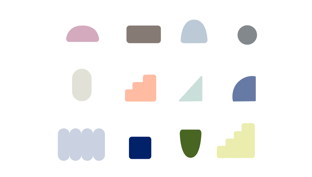
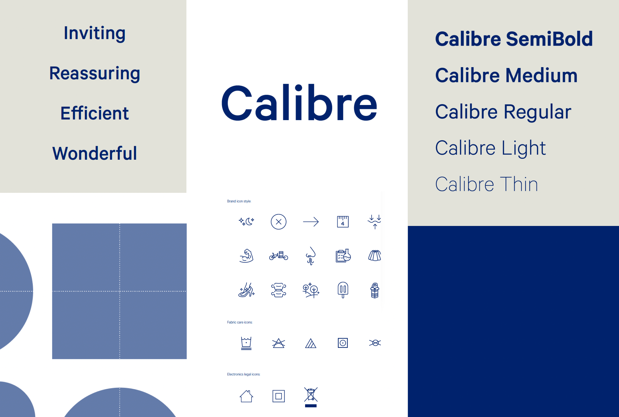
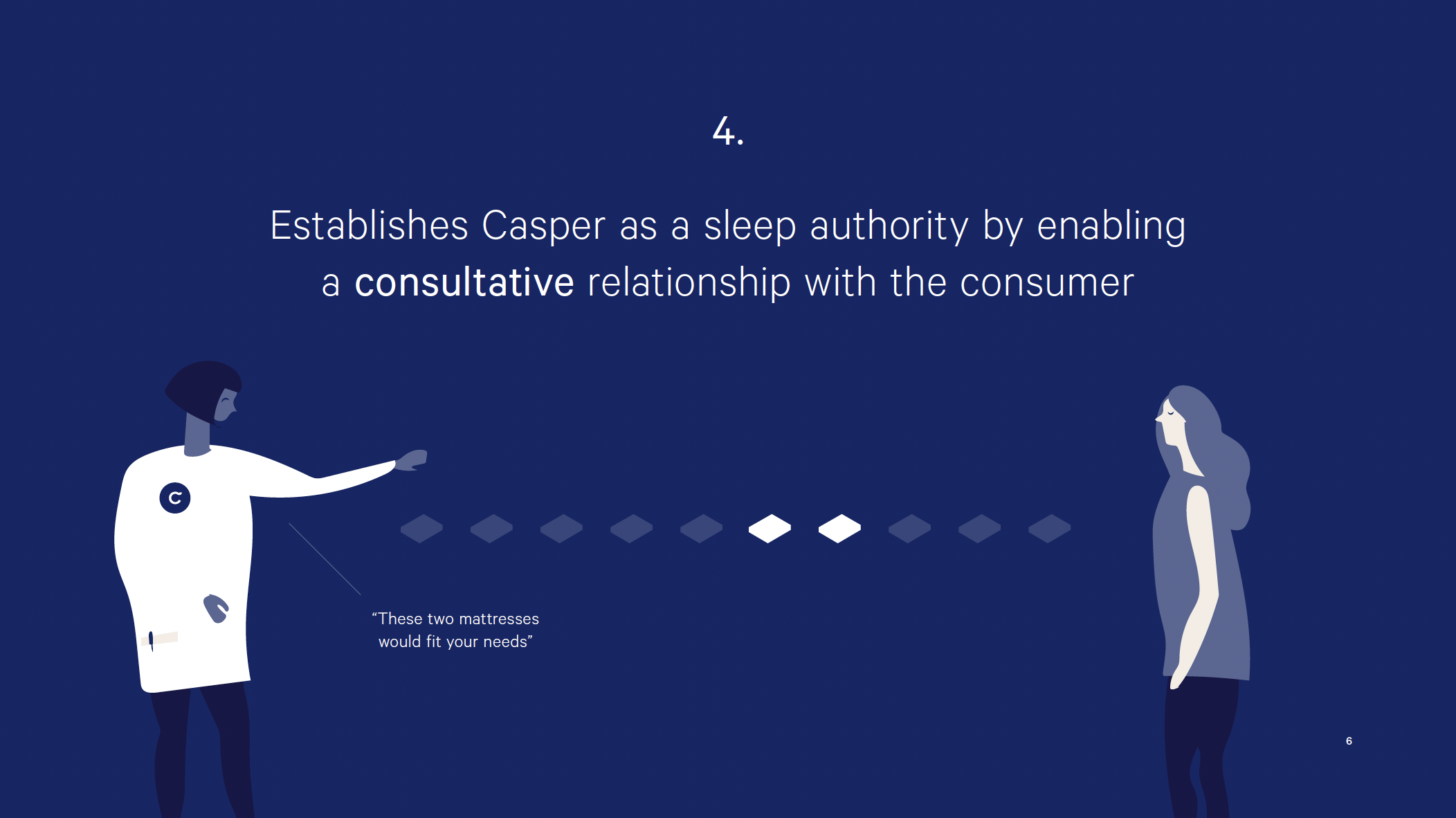
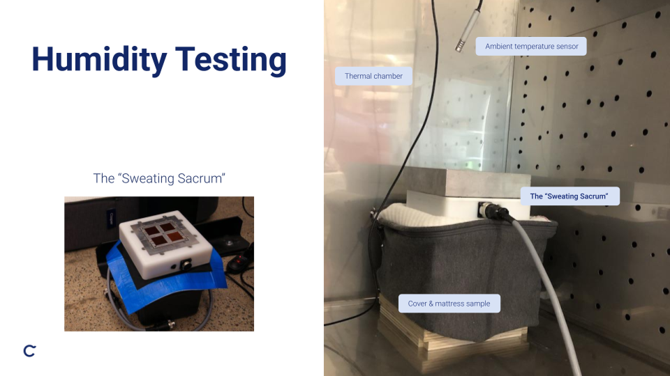
- Created custom illustrations, icons, and infographics to humanize complex HR concepts
- Developed flexible templates for onboarding, training decks, and internal campaigns
- Established repeatable design standards across People and L&D communications
- Partnered with subject-matter experts to ensure accuracy and alignment
- Delivered a scalable asset library to support long-term brand consistency
The Problem
Casper’s rapid transition to remote training created inconsistencies in how content was delivered. The experience felt fragmented, difficult to navigate, and overly text-heavy, resulting in high cognitive load and low engagement.
How Employees are Affected
- Dense content made the training hard to follow
- Inconsistent layouts and language created friction
- Key information was hard to find or interpret
- Training experience varied significantly across departments
How HR & Learning Teams are Affected
- Materials required constant manual updating
- No shared patterns or standards for internal communication
- Complex HR topics needed clearer, more empathetic explanation
- Time spent designing overshadowed time spent improving learning outcomes
enabling employees to process information more efficiently and helping HR teams produce content more effectively
Our Solution
We created a centralized learning experience system that unified visual language and UX patterns across Casper’s internal communications. The system focuses on clarity, structure, and accessibility, which enables employees to process information faster and helps HR teams produce content more efficiently.
The System Included
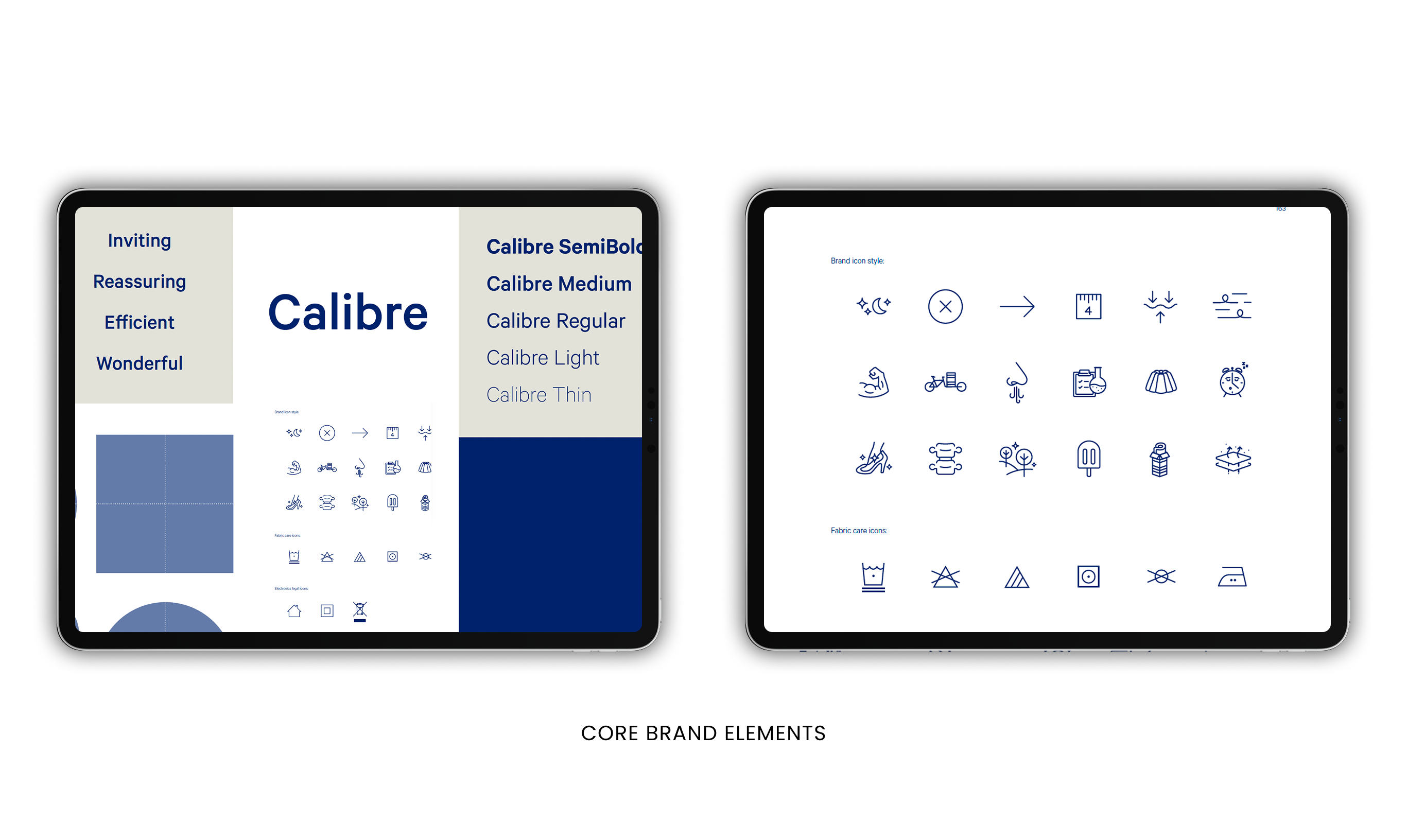
- A standardized design language for all training and onboarding materials
- A clear typographic and content hierarchy to reduce cognitive load
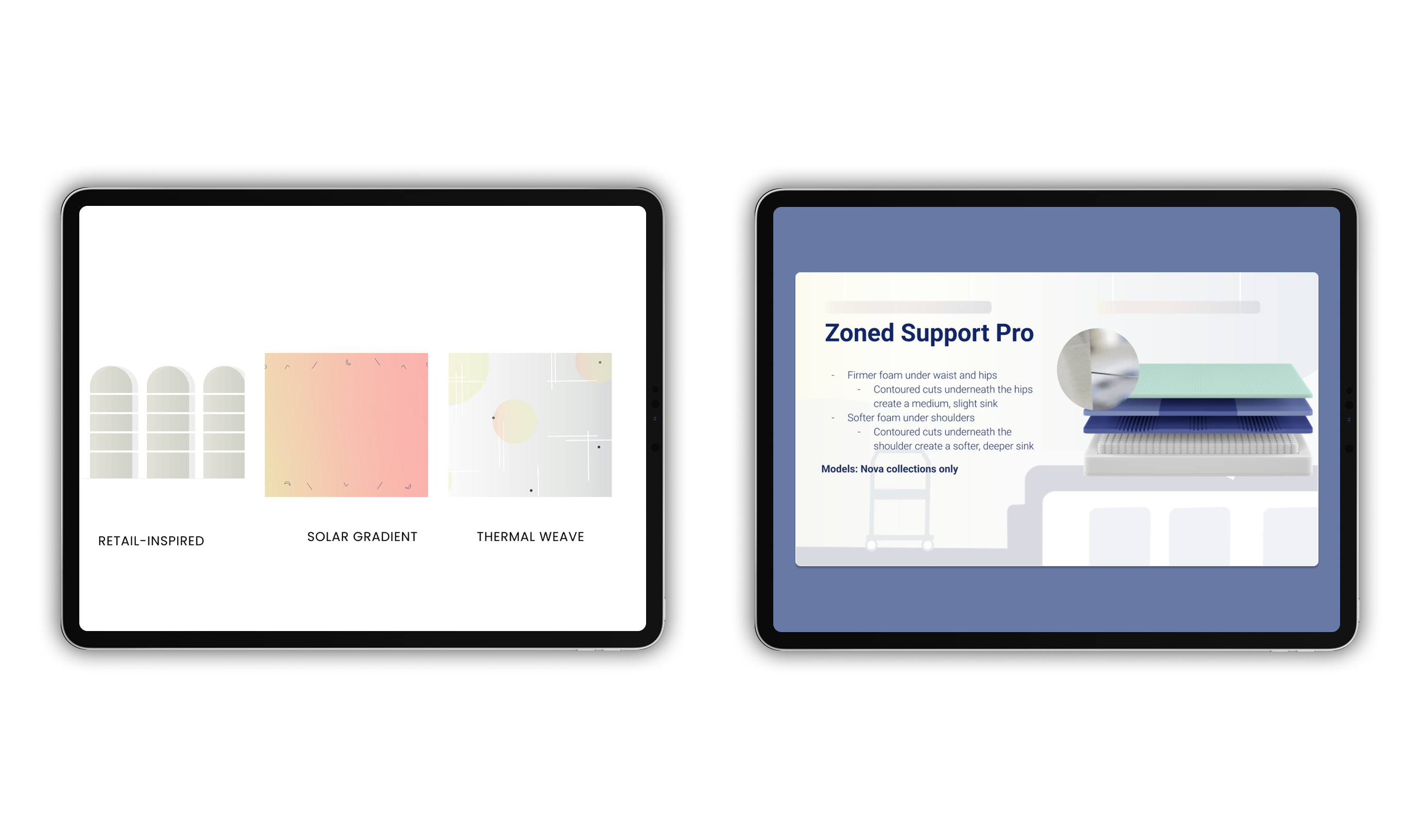
- Custom iconography and illustrations that reinforced comprehension
- Reusable templates for trainings, onboarding, internal campaigns, and events
- A scalable visual library ensuring consistency beyond the engagement period
The outcome: a unified communication ecosystem that made trainings more intuitive, human, and easy to maintain.
Why a Learning System Matters
1. Improved Comprehension
Structured layouts and supportive visuals help employees absorb complex information faster and with less cognitive fatigue.
2. Higher Engagement
Illustrations, infographics, and UX-aligned content patterns make trainings more dynamic and memorable.
3. Operational Efficiency
Reusable templates and a shared visual library reduce production time, freeing HR and L&D teams to focus on learning outcomes instead of asset creation.
The Process
1. Audit & Alignment
I conducted an end-to-end review of onboarding flows, training decks, and communication touch points to identify friction points, inconsistencies, and opportunities to improve information architecture.
2. System Development
- Established rules for color, typography, iconography, spacing, and layout
- Created illustrations and infographics that clarified complex HR topics
- Developed templates for training, onboarding, career pathways, and internal campaigns
- Defined repeatable UX patterns to support content discoverability and readability
3. Documentation & Handoff
Created templates and packaged assets into a library so internal teams could independently produce consistent training materials long after the contract ended.
Results
Higher Training Engagement
- Clear content hierarchy increased readability
- Employees were able to absorb complex HR information more quickly
- Training materials felt more approachable and human
Greater Operational Efficiency
- HR teams spent significantly less time recreating materials
- Templates accelerated communication across departments
- The system reduced inconsistencies and minimized revisions
Stronger Internal Brand & Learning Culture
- Visual consistency reinforced trust and clarity
- Employees experienced smoother, more intuitive onboarding and upskilling
- The visual system became a long-term L&D infrastructure asset
Gallery
Conclusion
The Casper L&D visual system shows how UX thinking paired with instructional clarity and visual cohesion can elevate the employee learning experience. By simplifying complex concepts, reducing cognitive load, and empowering non-designers with clear, usable tools, the system improved organization-wide understanding and operational efficiency. More than better materials, this work demonstrates how thoughtful UX for learning strengthens connection, culture, and the way teams grow together.

FAQ
A few things people usually ask me.
What kinds of design services do you offer?
I provide end-to-end product design services, including research, wireframes, UI/UX, prototypes, branding, and visual design. Each project is tailored to meet the client’s needs.
How do you work with clients and teams?
I collaborate closely with stakeholders such as brand designers, UX leads, and developers. I follow an agile, iterative process to integrate feedback, refine designs, and ensure smooth handoffs to development.
What is your typical project process and timeline?
Projects start with discovery and user research, then move through wireframing, interactive prototyping, design implementation, and developer handoff. Timelines vary by project scope, but I aim for clarity and efficiency at each stage.
What can I expect after the project is delivered? Do I keep the design files or get support?
After completion, I hand over all design assets, including mockups, source files, and style guides. I can also provide post-launch support or guidance for future iterations and maintenance.
.svg)